UX
UX/UI Design: Astrology App
Researching, designing, and testing an astrology app concept.
Challenge
People want astrology readings but don't know how to find reputable astrologers, and no single resource offers everything they need.
Solution
Design the minimum viable prototype of a mobile app that allows users to instantly connect with astrologers.
Outcome
An inclusive astrology app with 3 distinct features, offering users exactly what they want.
My Role
Sole UX/UI Designer
01 Discover
Business Opportunity - Competitive Analysis - Survey - User Interviews
The mystical services industry is worth $2.2 billion
...and this number is growing. It's no wonder, as astrology offers guidance and support in these increasingly stressful times.
To develop a useful, sought-after product, exploratory research began with competetive analyses. 2 popular astro-related apps were considered top contenders: Sanctuary Astrology and Kasamba.
Sanctuary offers instant access to astrologers, and their marketing strategy and social media presence make them Aspect's top direct competitor.
Kasamba also offers live astrology readings and has been in business for decades, suggesting an extensive client base.
Top 3 market gaps to fill
Based on S.W.O.T analyses of Sanctuary Astrology and Kasamba
Pricing
Qualifications
Reviews
After determining the viability of the project, 22 people were surveyed to gather insight on their interest in astrology and what they look for in an astrologer.
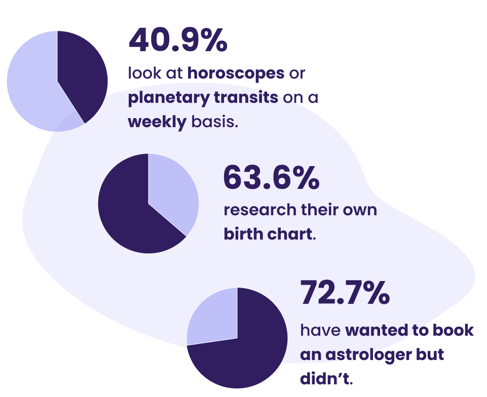
Most important criteria when seeking an astrologer
- Verified expertise (63.6%)
- Astrologer's background (63.6%)
- Client reviews (45.5%)
People don't book astrology readings because they are
- Unsure of astrologer's credibility (64.7%)
- Unsure whom to book with (64.7%)
The survey was followed up with 4 user interviews with self identified astro-enthusiasts. The goal was to gain a deeper understanding of motivations for following astrology, experiences working with astrologers, and expectations of astrological content.
User interview key findings
- Users engage with astrology for fun, connection, and self knowledge
- Users won't book readings if they aren't certain the astrologer is trustworthy
- No single astrology resource provides all the information users need
02 Define
Problem Statement - User Personas - User Flows
The interviews surprised me and indicated users are seeking more than just access to reputable astrologers. Based on these findings I crafted a problem statement and initial hypothesis.
Problem statement
Users need a convenient platform where they can easily find qualified astrologers, connect with other astrology enthusiasts, and learn about themselves through their own unique birth chart.
Hypothesis
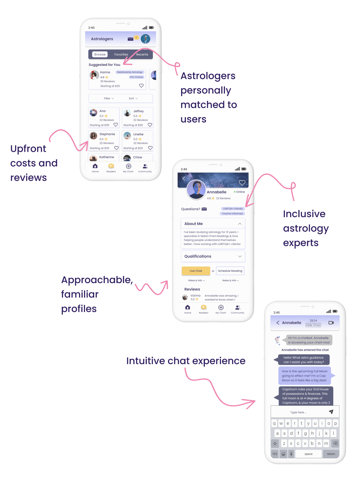
If we focus on offering access to inclusive astrology experts, user-astrologer compatibility, upfront costs and reviews, personalized astrology content, and creating a supportive community space, we will be well positioned to break in to the market with a product unlike any other.
User personas and user flows
To identify themes and parse out insights, I created an affinity map, and 2 distinct personas emerged. User flows followed and helped plan which features and screens were necessary for a user to complete a given task.
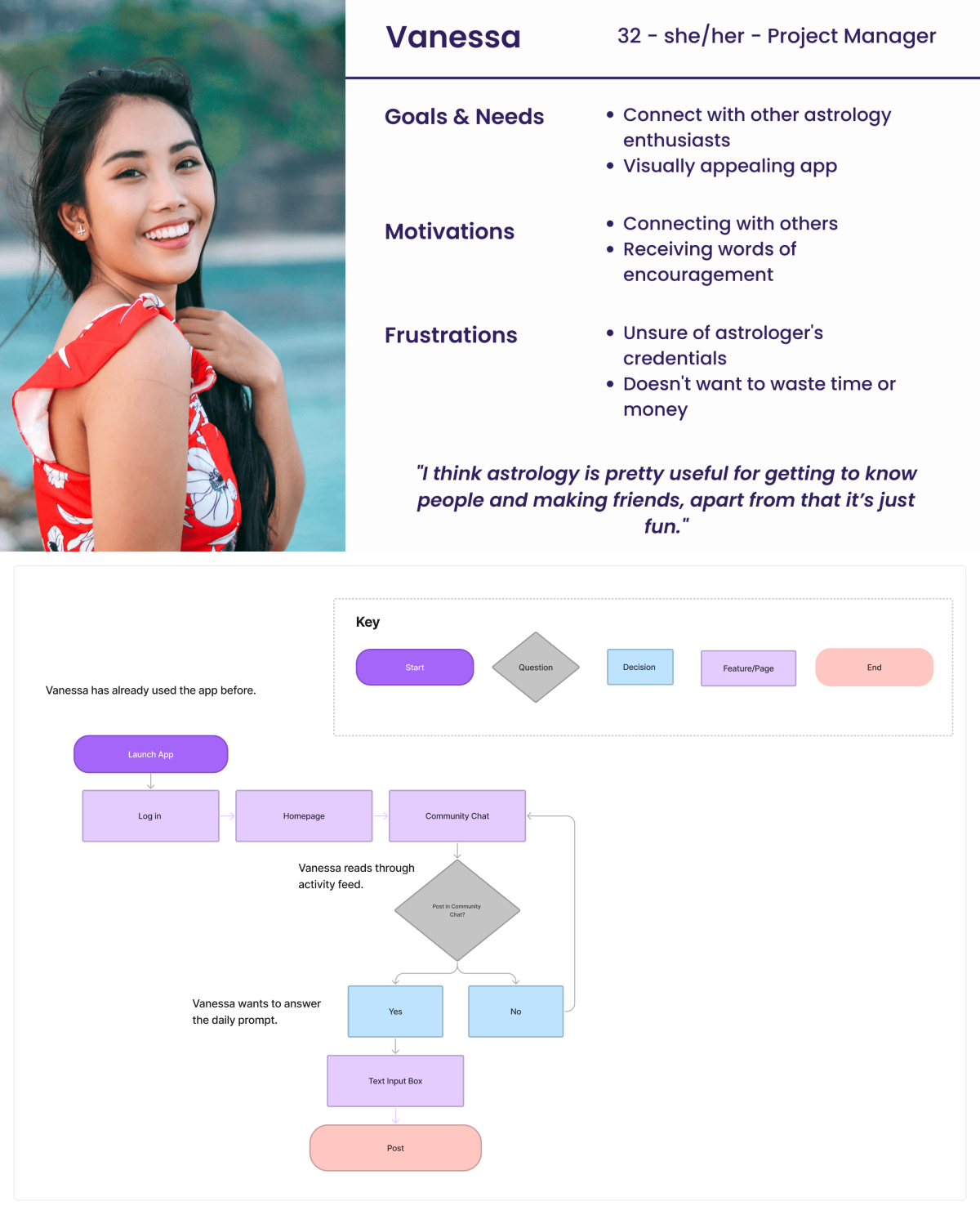
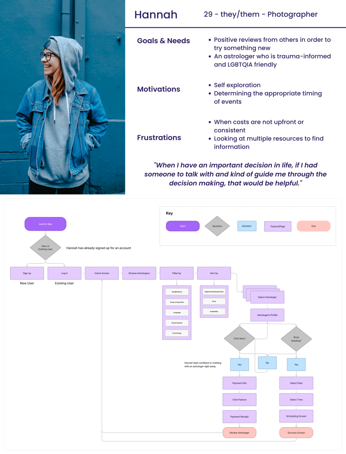
The culmination resulted in 3 main app features
- A way for Hannah to find an astrologer who fits their needs (Browse and Chat)
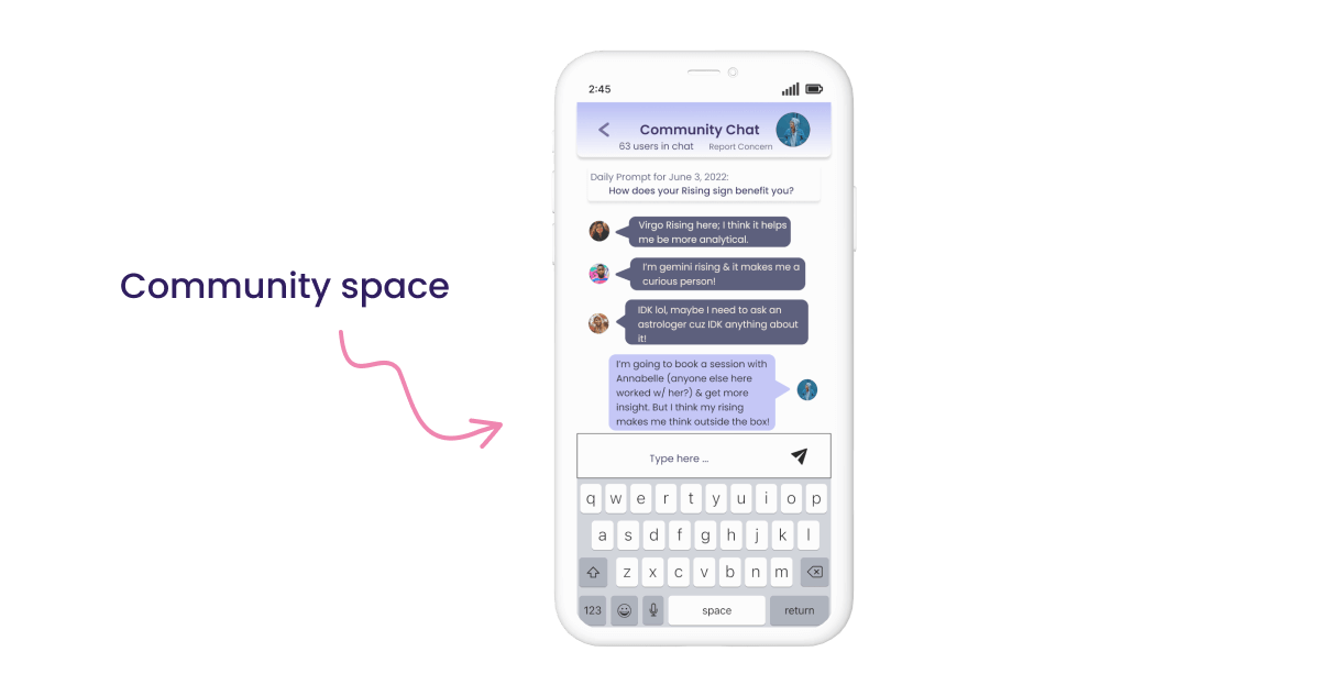
- A way for Vanessa to connect with others (Community Chat)
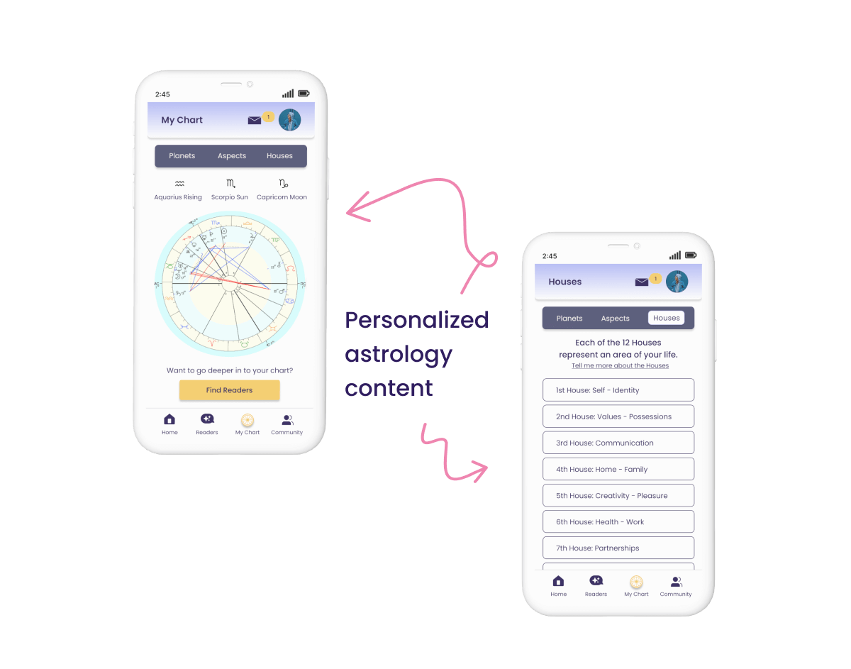
- A way for Hannah to delve in to self exploration (My Chart)
03 Ideate
Card Sorting - Information Architecture - Wireframing
With a clear understanding of target users and required screens, a hybrid card sort was used to create Aspect's site map. I wanted to offer the structure of defined categories so participants wouldn't abandon the study, while leaving room for their mental models to shine.
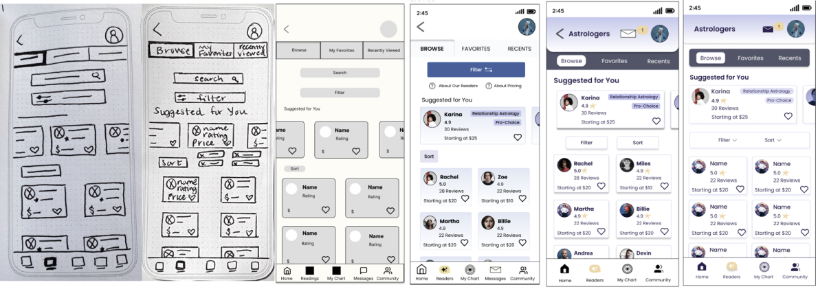
I created low-fidelity wireframes using pen and paper, including copy to provide context to the designs. After refining my ideas, I moved on to designing in Figma.
Here is an example of the iterative process for one of Aspect's main features, Browse Astrologers.
04 Prototype
Paper Prototyping - Final Prototype
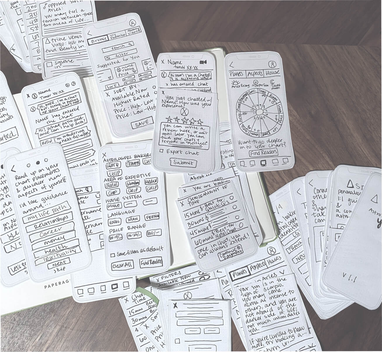
I began my prototyping process with my final paper sketches. In hindsight I created lots of extra work for myself and likely wouldn't do this again, but it's a nice keepsake and inspired confidence moving forward.
05 Test
Usability Testing - Preference Testing
The goal of testing was to measure for usability errors. Moderated remote testing was used for all 6 usability tests. Participants were given 4 tasks to complete.
Task scenario example
"You've registered for the app and can now see if there are any astrologers you might be interested in connecting with. How would you go about finding someone and connecting with them? Please show me."
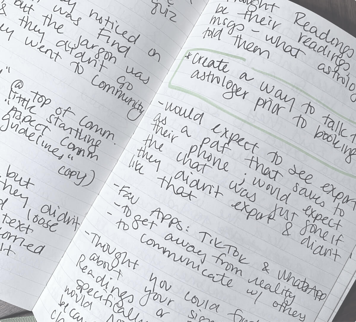
Notes from usability test sessions.
Usability test key findings
Information overload
Confusing copy
Expectations
Implemented changes
The feedback I received from usability testing allowed me to clean up screens, thereby reducing confusion. Based on test results I redesigned 3 screens and 20 participants voted on which they preferred. .
Option A: 17% of votes
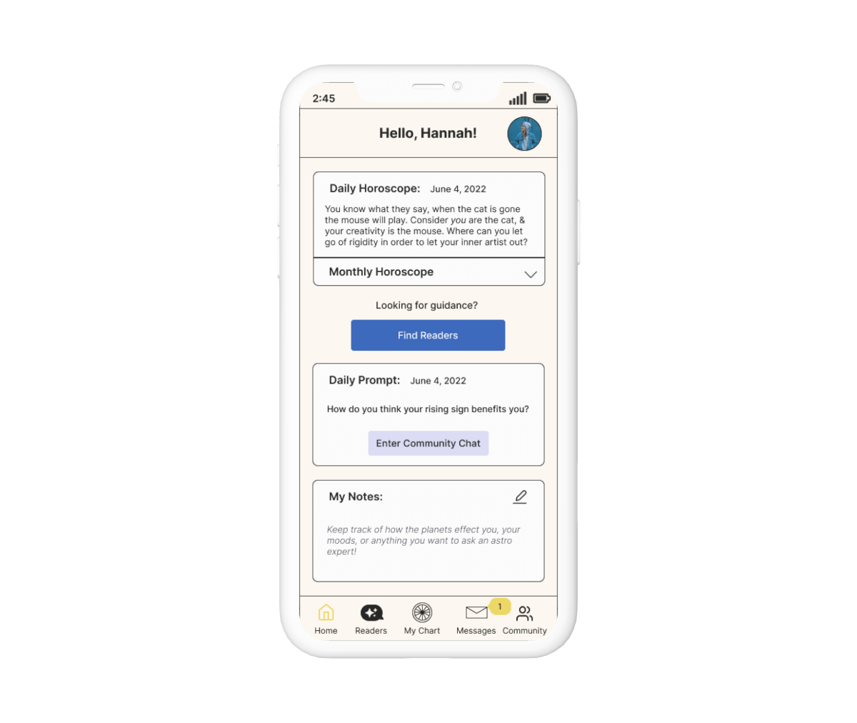
Option B: 83% of votes
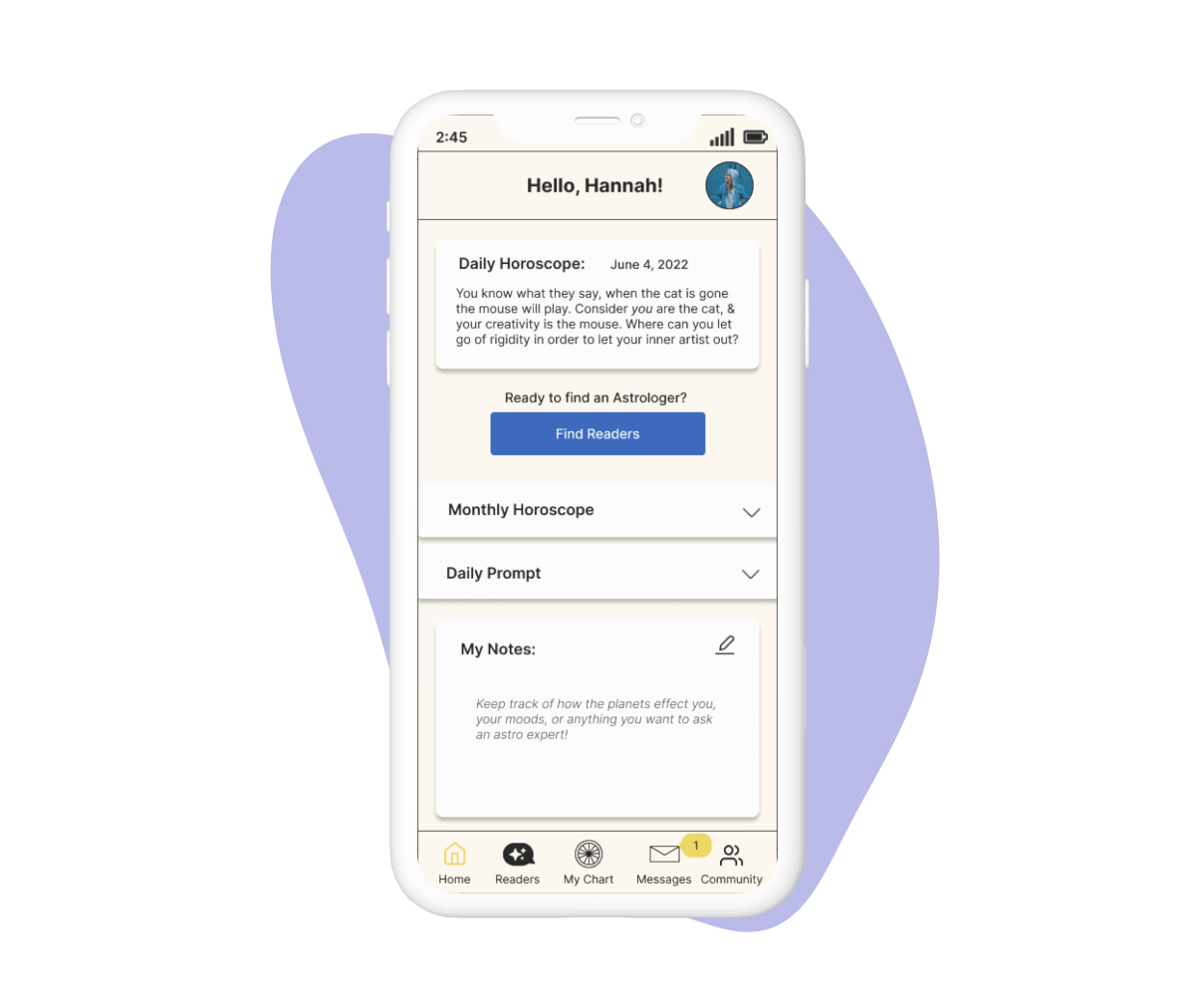
Why option B? Participants said it's
What do my peers think?
Before finalizing designs I participated in design critiques, receiving (and giving) feedback from 5 peers. Below is a single example of feedback I received and how I implemented changes.
Before
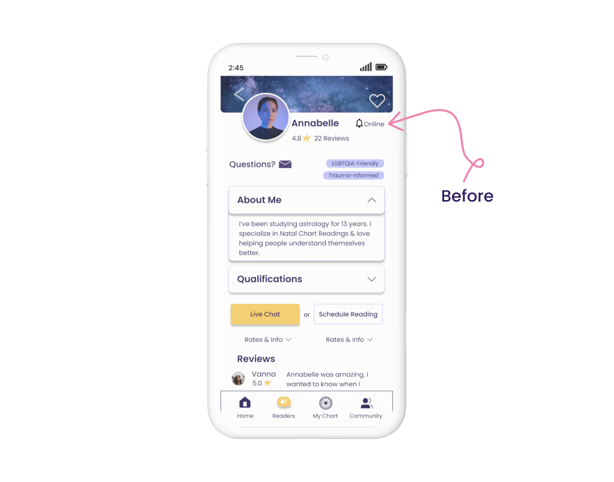
After

Feedback
“I think this profile page is very well laid out. One thing that confuses me is the bell and the word 'online' next to it. I can't tell if it's two separate icons or if they are supposed to correspond together.” - L.
Reasoning
The bell icon for scheduling a reading was confusing without context. I realized the user only learns about the bells’ purpose if they click on Rates and Info. This led me to consider adding a third status, "In Reading", to indicate the astrologer is online but busy. I considered designing a timer to display how long they'll be occupied but haven't pursued this as it will require additional time to design in a user-friendly, aesthetically pleasing way.
06 Document
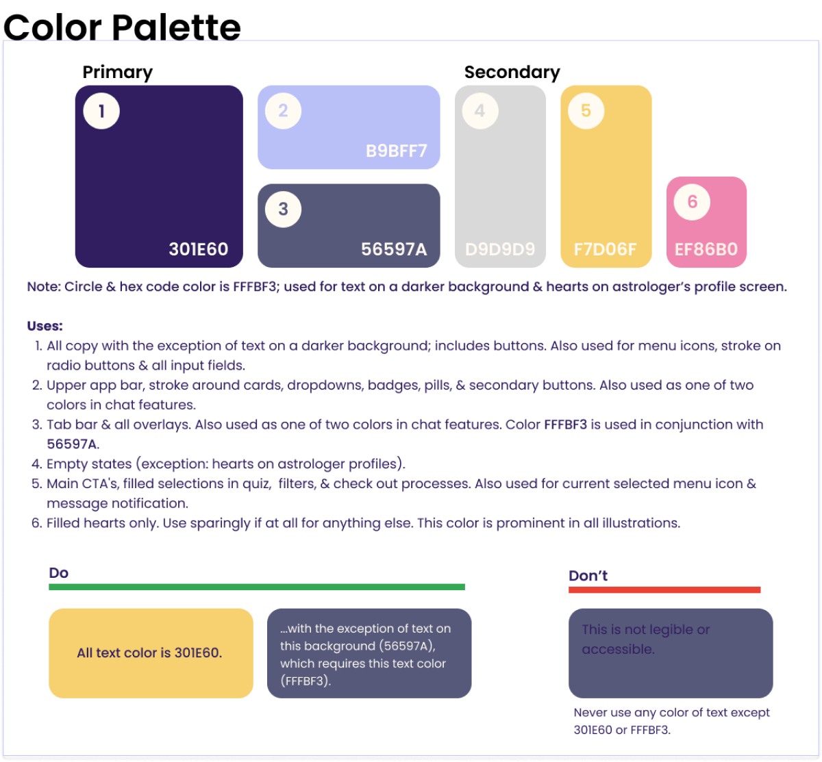
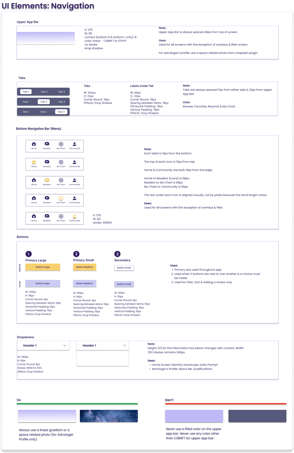
Design System - Style Guide
I made informed decisions regarding feedback by applying my design system, style guide, and accessibility knowledge to justify declining or accepting any proposed changes.
07 Final Designs and Reflections
Top 3 Features - Next Steps
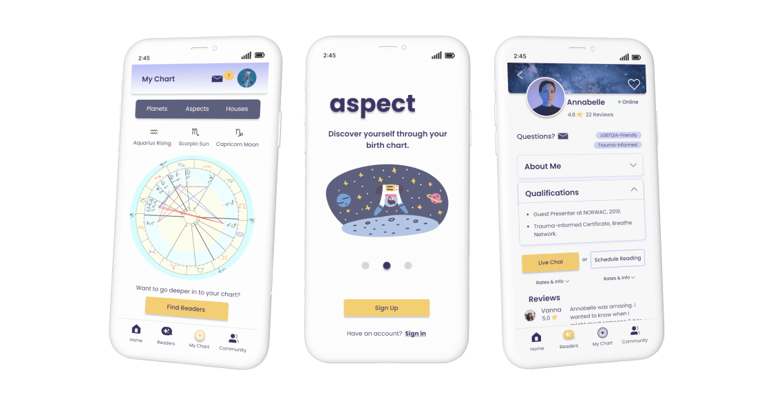
Final iterations took in to account web accessibility best practices, usability heuristics, and the real-life feedback of everyone who helped shape Aspect. I designed a minimum viable product with 3 distinct features that offers users exactly what they want, all in one convenient app.
Browse and chat with an astrologer
My chart
Community chat
As a new product on the market, the KPI (key performance indicator) to measure is user return rate, a relatively easy metric to track that holds invaluable insight. How many users are booking an astrologer through our platform, and how many are returning to book again? If the user experience is poor because of the apps' flow, the user interface, the copy/content, the astrology experts, or any other number of reasons, we may find users do not return.
Aspect is a genuinely profitable business venture. Testing would need to be done on a much larger scale with more participants but I stand behind the idea as an entry point in to this quickly growing industry.
